Friday, December 18, 2015
Thursday, December 17, 2015
Cd
This is my first draft CD and i feel very happy with the simplistic and minimalist feel to it; i feel like the disks are often too crowded with image i feel they should be left as simplistic as possible.
Back cover
this was the basic template i based the rest of the back cover on; the two images were cut and cropped to fit so that the faces and background matched. i then used a shape tool to outline the triangles and create an X shape to cut up the image. from this i put a transparency and invert on the triangles so that the colours of the base image were inverted slightly so it was obvious that the triangles were different to the image itself to give the image some depth.
i added some further detail to the image; such as an underlining under the title, additional content to make the image look more authentic (using my label "Slash records) etc.
i realised after publishing that there was a blue line across the top of the bottom strap line; i fixed this by placing a purple bar over the top to stop this conflict.
Wednesday, December 16, 2015
Inside cover
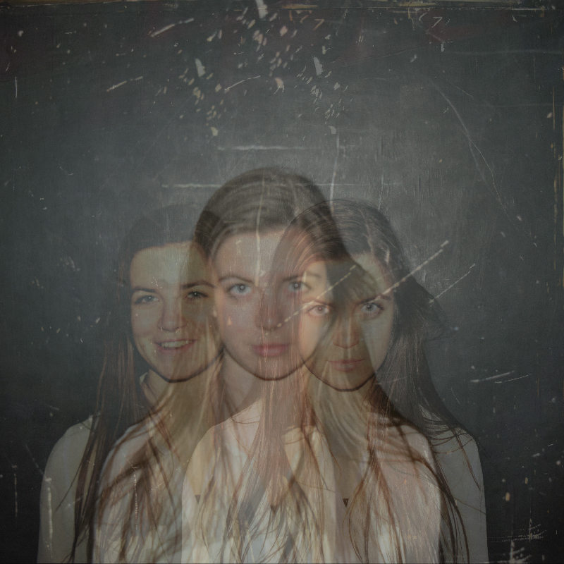
This is the inside cover i am using for my Digipak; I created a ghosting effect using Fotor (An online image editing side) by placing three of my photos over one another and reducing their transparency to 60% each besides the top image which remained at a higher transparency to make it easier to see the other images behind it.
After consideration i used a tool to lower the lighting of th photo to fit the rest of the house style as well as keep attention off of this image as it's not what i want a potential viewer to be looking at.
Subscribe to:
Posts (Atom)