Friday, December 18, 2015
Thursday, December 17, 2015
Cd
This is my first draft CD and i feel very happy with the simplistic and minimalist feel to it; i feel like the disks are often too crowded with image i feel they should be left as simplistic as possible.
Back cover
this was the basic template i based the rest of the back cover on; the two images were cut and cropped to fit so that the faces and background matched. i then used a shape tool to outline the triangles and create an X shape to cut up the image. from this i put a transparency and invert on the triangles so that the colours of the base image were inverted slightly so it was obvious that the triangles were different to the image itself to give the image some depth.
i added some further detail to the image; such as an underlining under the title, additional content to make the image look more authentic (using my label "Slash records) etc.
i realised after publishing that there was a blue line across the top of the bottom strap line; i fixed this by placing a purple bar over the top to stop this conflict.
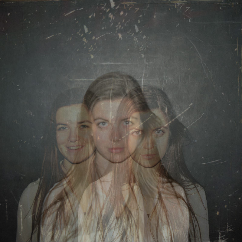
Wednesday, December 16, 2015
Inside cover
This is the inside cover i am using for my Digipak; I created a ghosting effect using Fotor (An online image editing side) by placing three of my photos over one another and reducing their transparency to 60% each besides the top image which remained at a higher transparency to make it easier to see the other images behind it.
After consideration i used a tool to lower the lighting of th photo to fit the rest of the house style as well as keep attention off of this image as it's not what i want a potential viewer to be looking at.
Front Cover
I simple and close up image of the artist with the same background that is consistent to the digipak and ancillary text, this is like a smaller version of the ancillary which showed an image of the artist (the ancillary photos were taken portrait to get a longer and more poster feel to them) looking directly at the camera.I felt this was appropriate to keep a consistent house style. however, unlike the poster this image was fully focused and was almost as if the ancillary had been a drum role to the actual album which would be used to create hype as the audience knew what they were getting but couldn't quite experience it yet.
ancillary second draft
A second attempt using a more vertical style and taking a more performance theme; in the sense that it looks more like a Broadway time performance which correlates to the theme of "on stage" performance in the video. I also used a larger amount of effect on the main image itself as i felt the first attempt looked too much like the photo had just been slapped onto a canvas
Ancillary Draft 1
A very minimalistic image of the artist set to a blank and rough background (one which obviously corresponds to the location the video was filmed in); a minimalistic studio setting with an often black background. The use of purple was an idea I thought to be good, I had planned to use purple as a house colour for the artist with some of my posts backgrounds having this as a main colour. I felt it suited to genre, the artist and the colour scheme.
Tuesday, December 15, 2015
Tuesday, December 8, 2015
Album cover conventions inspiration
Whilst both varying hugely in genre both of these covers show an interesting layout; with the use of corners and areas besides the centre of the page for use of text and other images. i find this interesting and will hope to incorporate this into my coursework.
Thursday, December 3, 2015
Setting
The setting for this is very
important; I am looking to use a large dark space as this is the perfect
setting for an ambiguous expressive act as it is leads the audience to focus on
the dance and the black represents how the dancer has shut out the rest of the
world because she is (as the audience is) solely focussed on the dance. I am
using a dance studio.
Some
shots I’ve used as inspiration can also be seen on the mood board I have on my
music video treatment. Wednesday, December 2, 2015
effects inspiration
Image morphing and blending is a technique id definitely try and attempt; it fits with the genre perfectly with the slow baselines and fluid beats. I can use adobe photoshot to blend two appropriate photos together however the time and effort may not be worth the outcome but it would be very attractive to pull it off.
Tuesday, December 1, 2015
Symbols in album covers
The use of symbols in album covers and digipaks creates a logo for the band besides their actual title/ name. This creates publicity and an easy way to spread hype about a product; Bring me the Horizon have used symbolism in numerous albums prior to release to create hype.
This is the album "Thats the spirit" and this image was spread over the internet as symbolic short term for the album.
Subscribe to:
Posts (Atom)